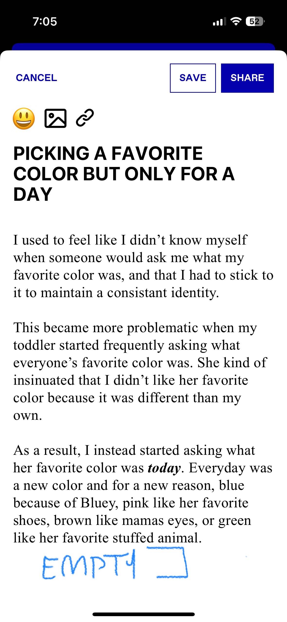
1. When you open a draft rec or any long rec you’ve written, there’s a white gap at the bottom, probably for iOS safe space, but the corners can be used for something else, and you can make the top of the white space transparent and the bottom opaque to show that there’s long text below.
2. When you open the keyboard the available text area is insanely small. There’s still an empty white gap below text field, very challenging to make long recs. (My rec would be, once keyboard opens, make the rec title a smaller font and if the user types past the visually available text field, make the top scrollable rather than fixed. remove the excess white space. Move ‘replying to ask:…’ to the right of the icon image and link selector. They are static so it just makes sense space wise)
3. If you go to add an icon to a draft rec, often times taping the emoji won’t work. Instead I open the image bottom drawer, and close it, beneath it the emoji selector will appear.
4. when starting a new rec, you can get the emoji drawer to show, but if you search and select you emoji post text search, the emoji doesn’t select and you have to tap again.
5. Finally, I’ve noticed that spellcheck on this thing is wacky as hell. When a new sentence starts it will decapitalize the word, or sometimes insert words that make no sense.
All that said, I love this app to pieces. thank u