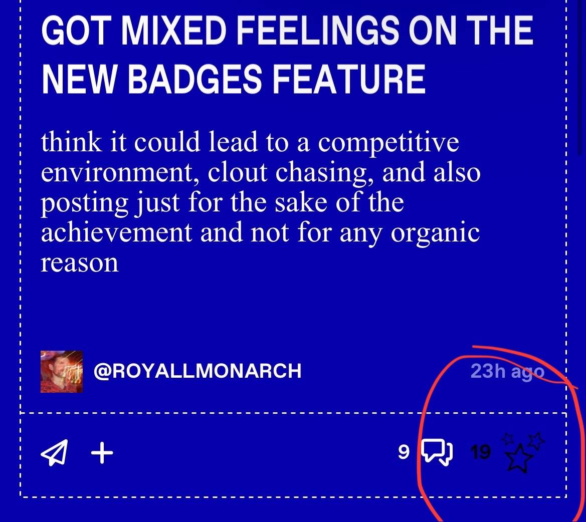
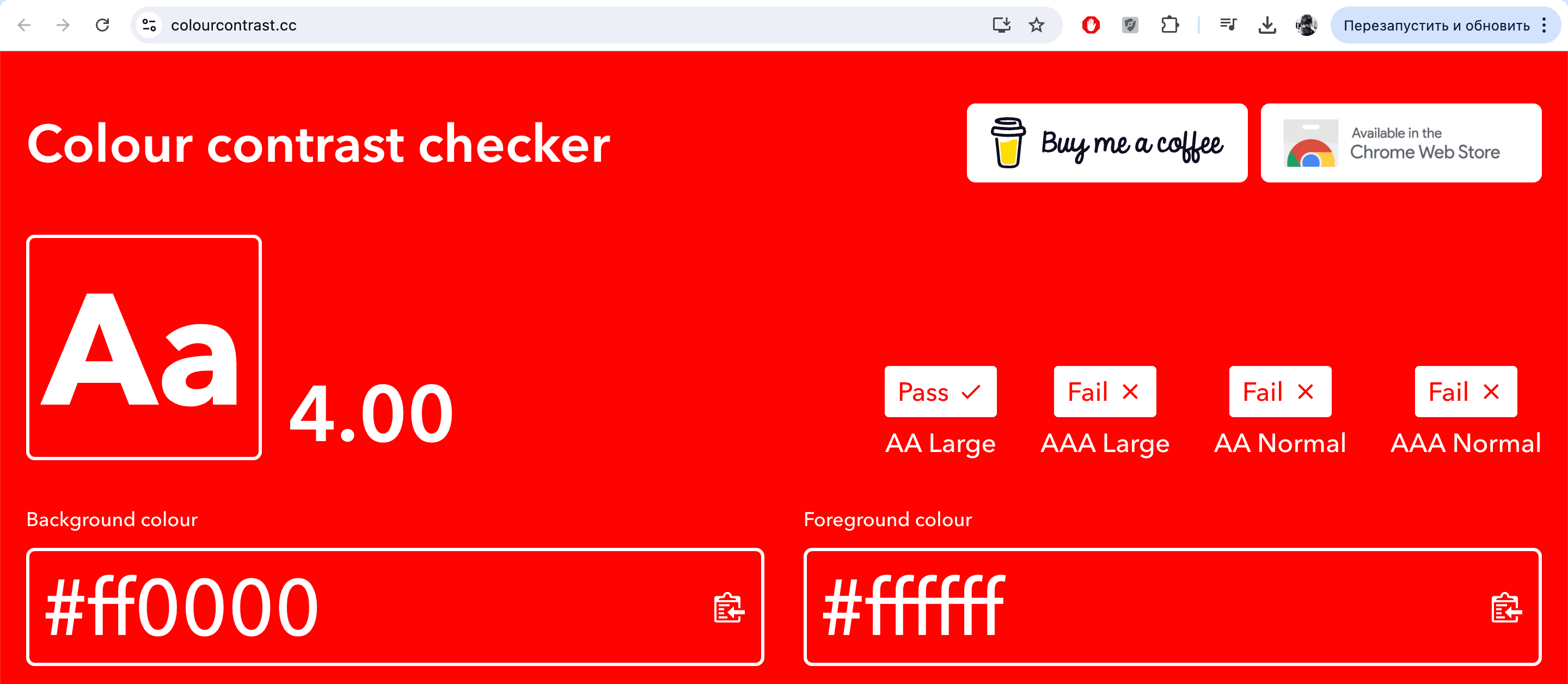
This may be more because i have my phone settings on the lowest brightness, but when going through replies to ask threads and trying to like them, i can barely see the likes star icon and numbers.
Also when i do like it, the icon and numbers disappears. If it was made like yellow or white to contrast on the blue color, that would be fantastic (which i think was how it was before)